Switch to
for
IELTS
| Powered by AI
Practice & Mock Tests for IELTS Writing Task 1 Academic
Free online practice with the 7 most common IELTS Writing Task 1 Academic question types. Get instant evaluation right after submission.
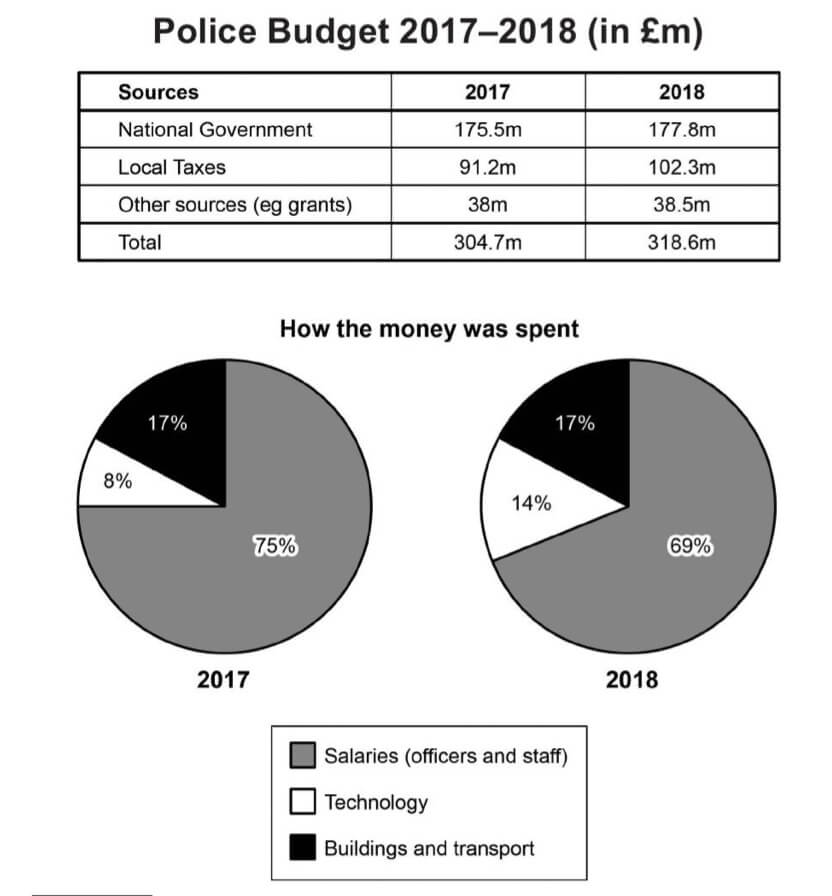
Table
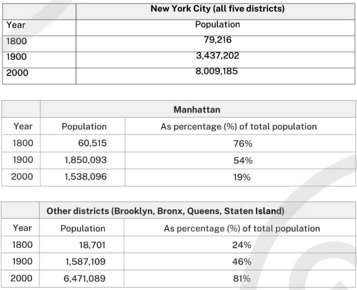
Summarise the information by selecting and reporting the main features, and make comparisons where relevant.
Write at least 150 words.
Map
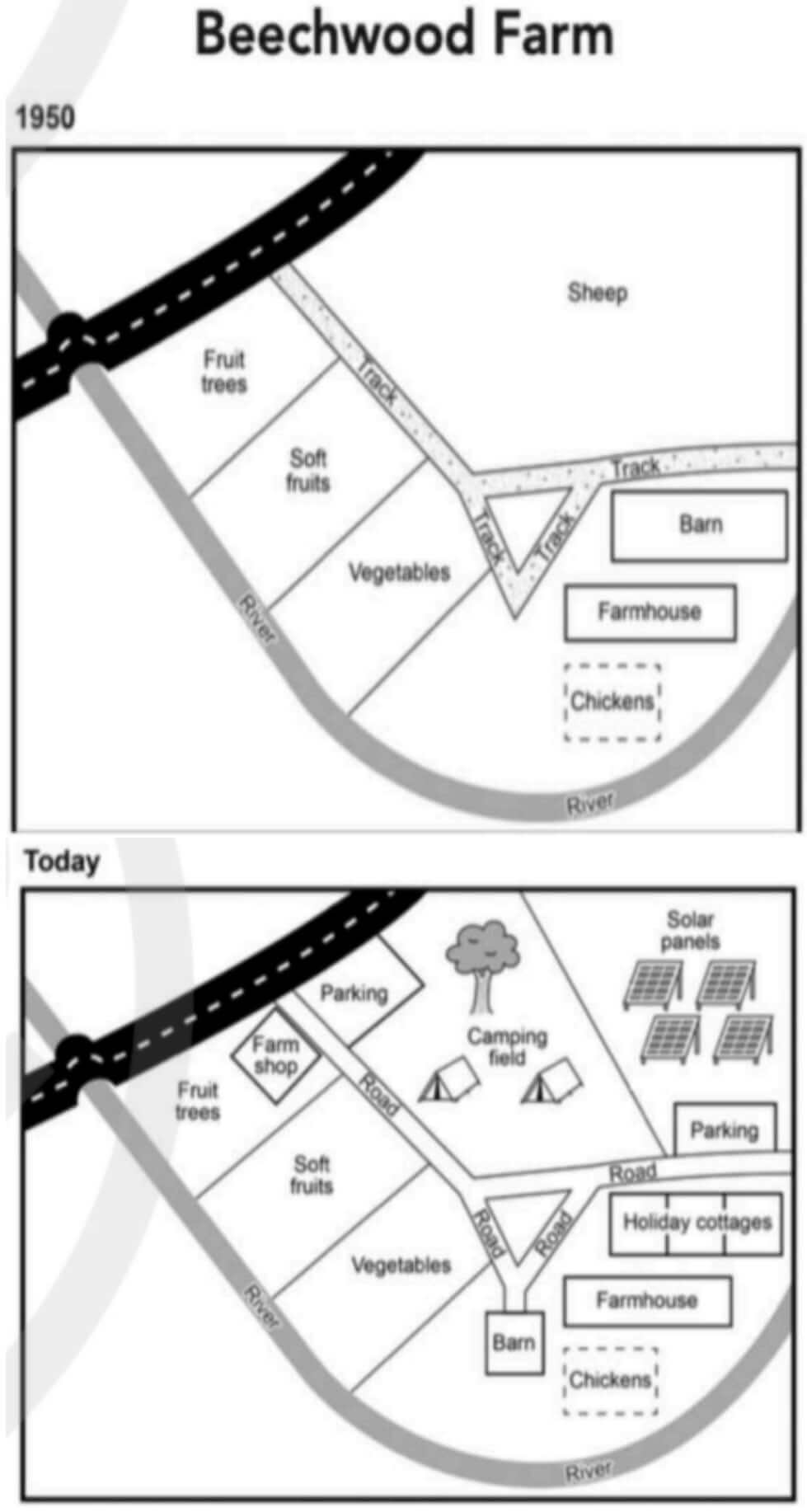
Summarise the information by selecting and reporting the main features, and make comparisons where relevant.
Write at least 150 words.
Multiple Chart
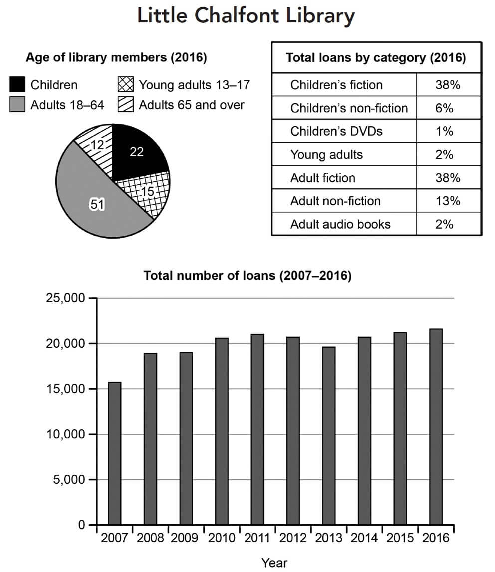
Write at least 150 words
Process
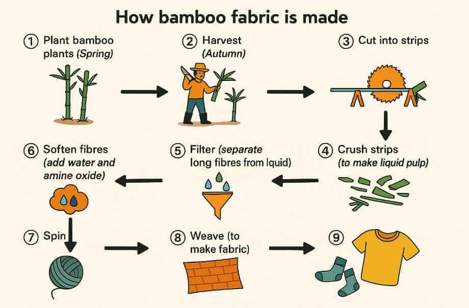
Write at least 150 words.
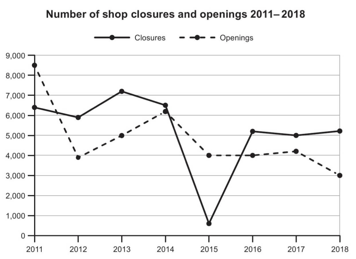
Line Chart
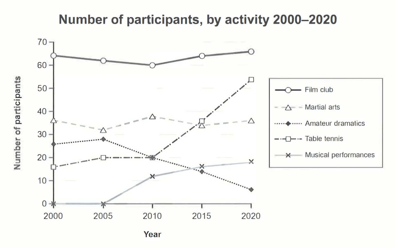
Summarise the information by selecting and reporting the main features, and make comparisons where relevant.
Write at least 150 words.
Map
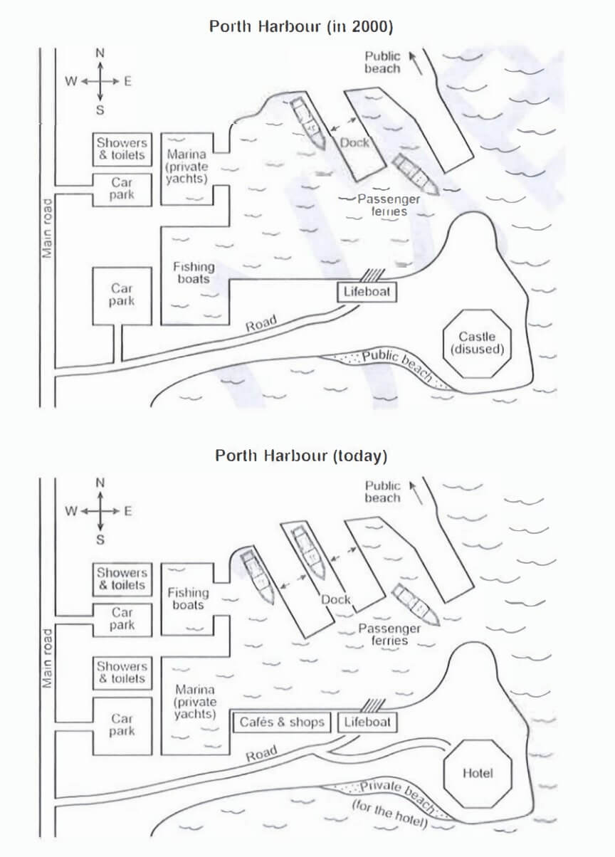
Summarise the information by selecting and reporting the main features, and make comparisons where relevant.
Write at least 150 words.
Process

Summarise the information by selecting and reporting the main features, and make comparisons where relevant.
Write at least 150 words.
Multiple Chart
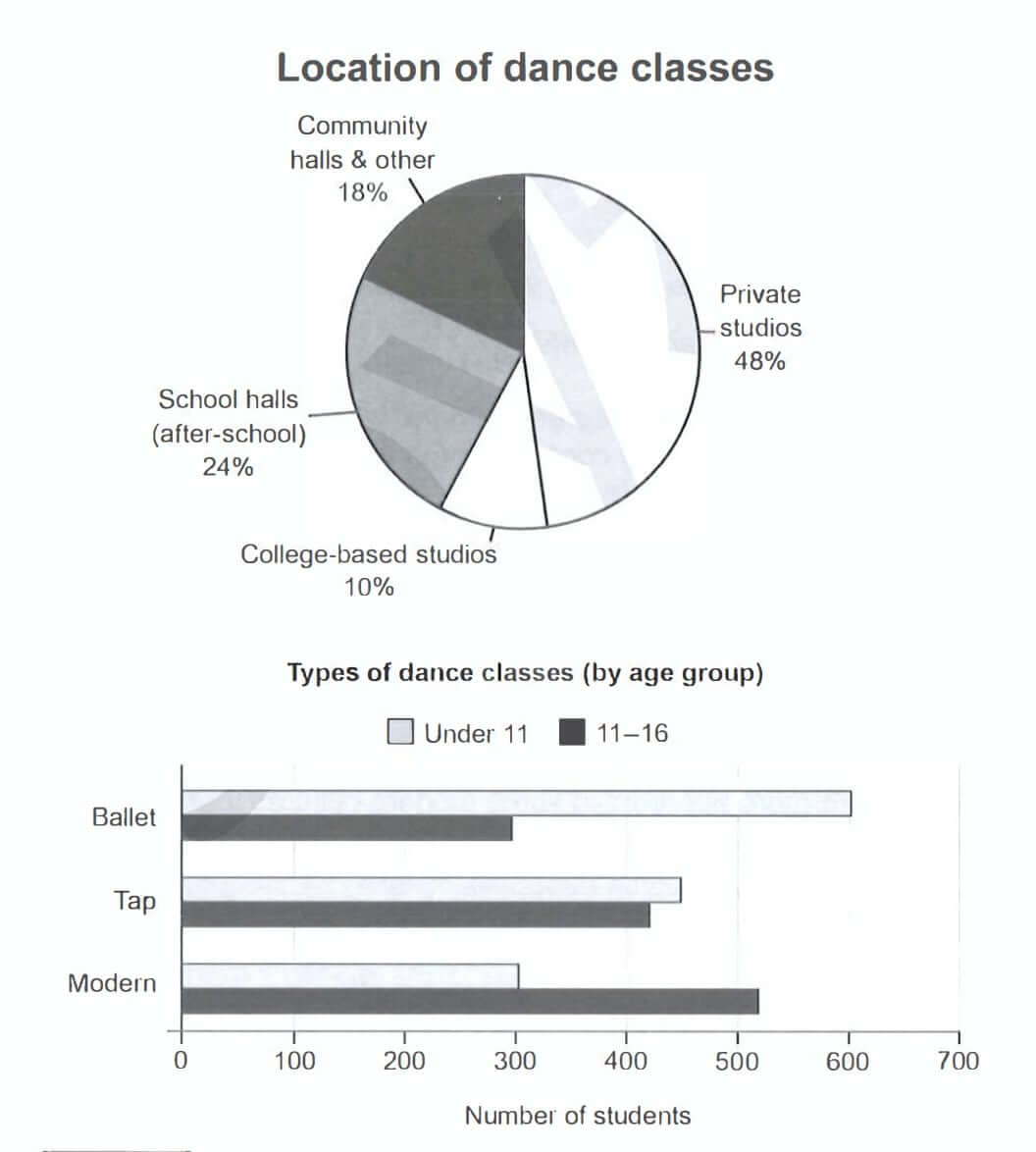
Summarise the information by selecting and reporting the main features, and make comparisons where relevant.
Write at least 150 words.
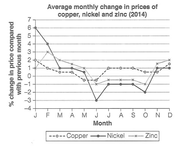
Line Chart
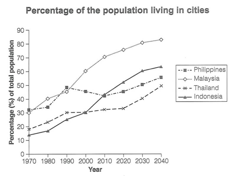
Summarise the information by selecting and reporting the main features, and make comparisons where relevant.
Write at least 150 word.
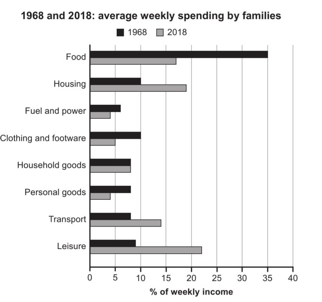
Bar Chart
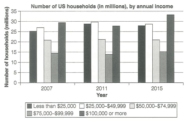
Summarise the information by selecting and reporting the main features, and make comparisons where relevant.
Write at least 150 word.
Map
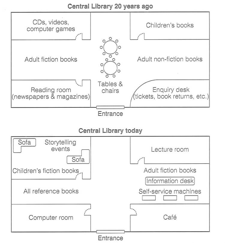
Summarise the information by selecting and reporting the main features, and make comparisons where relevant.
Write at least 150 word.
Line Chart
Summarise the information by selecting and reporting the main features, and make comparisons where relevant.
Write at least 150 word.
Map
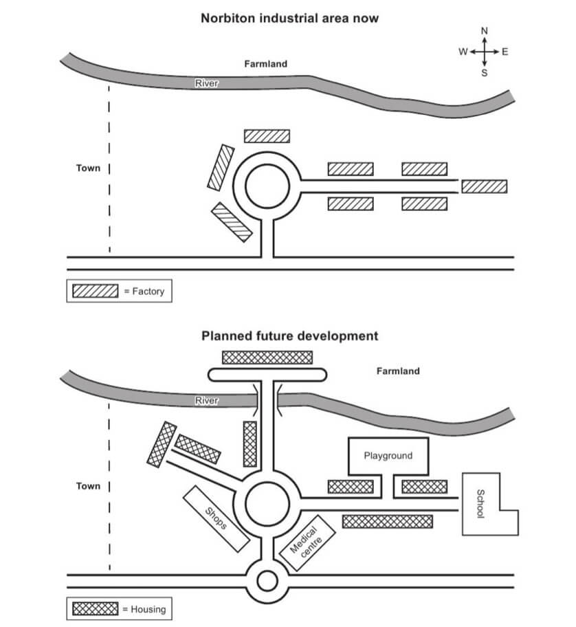
Summarise the information by selecting and reporting the main features, and make comparisons where relevant.
Write at least 150 word.
Mixed Data
Summarise the information by selecting and reporting the main features, and make comparisons where relevant.
Write at least 150 word.
Bar Chart
Summarise the information by selecting and reporting the main features, and make comparisons where relevant.
Write at least 150 word.
Line Chart
Summarise the information by selecting and reporting the main features, and make comparisons where relevant.
Write at least 150 word.
Updating…
Boost your band score and build confidence before test day
Your All-in-One IELTS Writing Prep Tool
LexiBot gives you everything you need to prepare for IELTS Writing at home — powered by AI.
Simulate Real Exam Pressure
Get random questions and write under timed conditions, just like in the real test.
Huge Question Bank
Over 5,000 IELTS Writing prompts covering all topics and task types — ready for you to practice anytime.
AI Writing Assistance & Feedback
In Practice Mode, LexiBot AI helps you plan your ideas and write your response step-by-step.
Instant Results
Submit your writing and receive an estimated band score, feedback, and suggested corrections immediately.
FAQs – Frequently Asked Questions
Answers to common questions while practicing and taking mock IELTS Writing Task 1 Academic tests.
What is the time limit for IELTS Writing Task 1 Academic?
The total time for the Writing test is 60 minutes, covering both Task 1 and Task 2. It’s recommended to spend about 20 minutes on Task 1, since it counts for one-third of the Writing score, requires less argumentation, and is generally easier to score well on compared to Task 2.
What are the common types of IELTS Writing Task 1 Academic questions?
There are 7 common types:
Line graph
Bar chart
Pie chart
Table
Process diagram
Map
Multiple charts
What is the minimum word count for IELTS Writing Task 1 Academic?
You must write at least 150 words. Falling short of this may negatively affect your score, so aim to meet or slightly exceed the minimum word count.
How is IELTS Writing Task 1 Academic different from General Training?
Yes, they are different. In the Academic test, Task 1 requires you to describe and compare data from charts, tables, diagrams, or processes. In the General Training test, Task 1 is letter writing, often based on everyday situations such as requesting information, making a complaint, or giving an apology.
Is there a maximum word limit for IELTS Writing Task 1 Academic?
No, there’s no official maximum. However, the safe range is 150–200 words. Writing much more doesn’t guarantee a higher score and may take away valuable time needed to review your work.
Lorem Ipsum is simply dummy text of the printing and typesetting